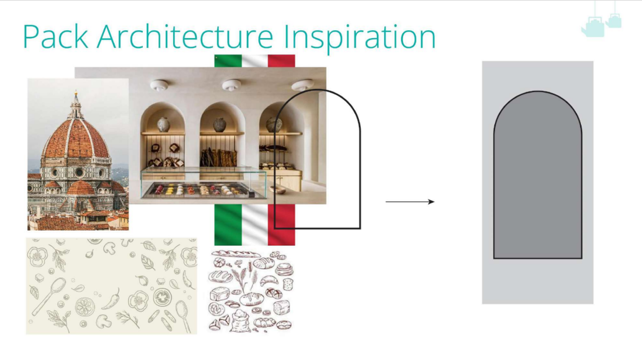
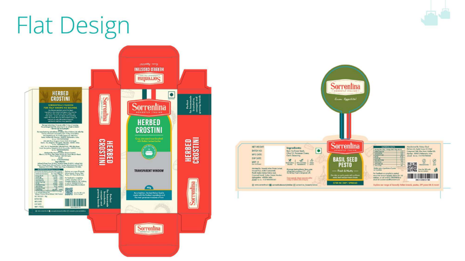
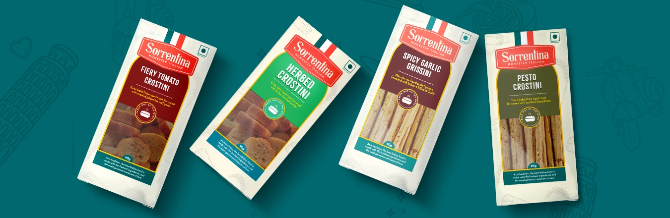
×

BACKGROUND

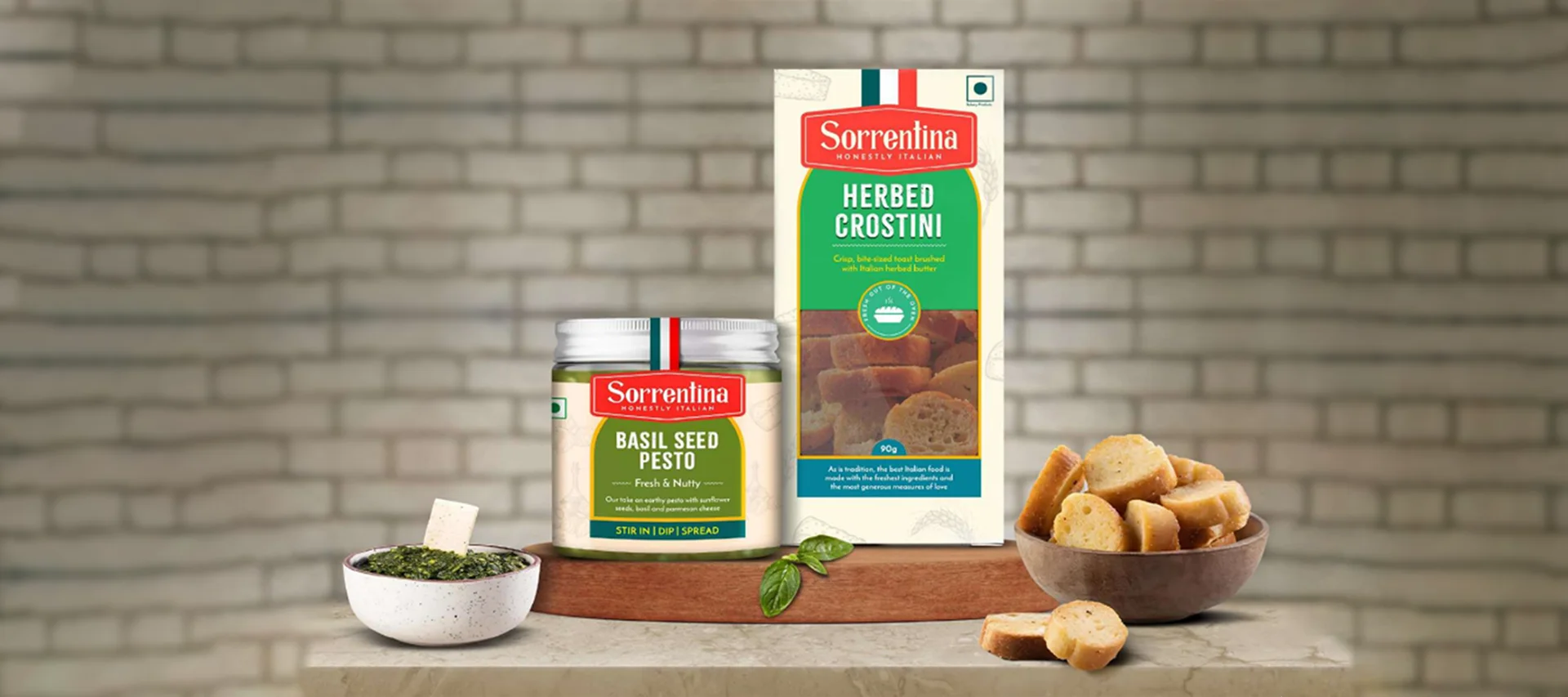
Sorrentina is a premium brand known for its authentic Italian culinary offerings, crafted with a deep respect for traditional recipes and high-quality ingredients. The brand brings the rich flavors of Italy to the modern kitchen, offering a range of products that embody the essence of Italian cuisine, from pastas, dips and sauces to artisanal bread and desserts. The brand embodies a perfect blend of modern innovation and time-honored tradition, making it a go-to choice for those who appreciate the finer things in life.

BRIEF, OBJECTIVE & TASK

Italian gourmet products continue to captivate food enthusiasts, particularly those who value authenticity and premium quality in their culinary experiences. In this space, Sorrentina has established itself as a brand synonymous with rich Italian tradition and refined taste. Sorrentina, known for its extensive range of baked products, pasta, sauces, and pizza bread, required a packaging design that could seamlessly unify its diverse offerings while reflecting the brand's commitment to authentic Italian craftsmanship. The challenge was to create a Brand Visual Architecture that not only captured Sorrentina's premium, international appeal but also allowed for smooth transitions across various pack structures and product categories. The design needed to convey the brand's sophisticated, gourmet identity while ensuring consistency and adaptability, enabling each product to stand out individually yet remain cohesive as part of the Sorrentina family.

APPROACH & RESULT

Our design approach was deeply rooted in the study of Italian culture and heritage. We sought to capture the essence of Italy’s rich culinary tradition and aesthetic elegance, elements that would appeal to a discerning, premium audience. The inspiration came from Italy’s timeless architecture, its vibrant landscapes, and the artisanal craftsmanship that the country is renowned for. The architectural elements seen on the packaging were not merely decorative; they played a foundational role in establishing the visual architecture for the entire packaging design. Drawing inspiration from iconic Italian structures, we delved into the intricate patterns of Roman mosaics and the elegant, flowing curves of Tuscan vineyards. We integrated these elements into the packaging in a way that they not only added visual appeal but also conveyed the brand’s heritage and premium positioning. One of the critical aspects of this project was ensuring that the new design language could be smoothly extended across different pack structures. The visual architecture we created allowed this flexibility, ensuring that the design could be adapted to various packaging formats without losing its integrity or appeal. To clearly differentiate between the various products in the Sorrentina range, we employed a thoughtful and consistent approach centered around three key elements: the variant name, the product shot, and the band color behind the variant name. Each variant was given a distinctive identity through its unique band color, which was carefully chosen to resonate with the specific product it represented. The product shot further visually reinforced the variant's identity. Together, these elements created a cohesive yet easily navigable packaging system that allows consumers to quickly identify and select their preferred product.

Explore More Brand Associations
Want to work with us?