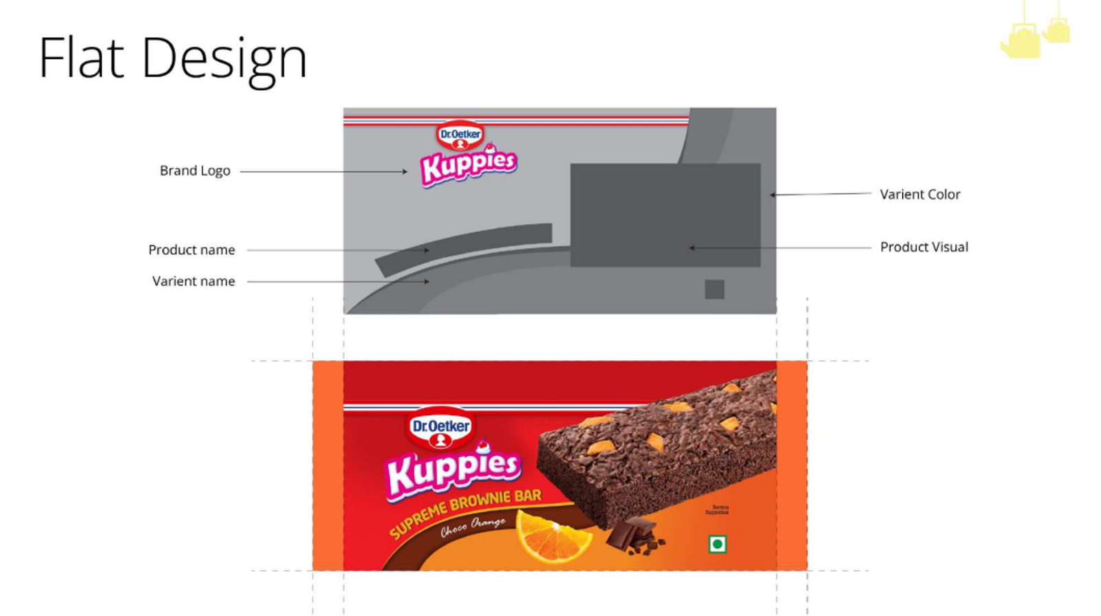
×

BACKGROUND

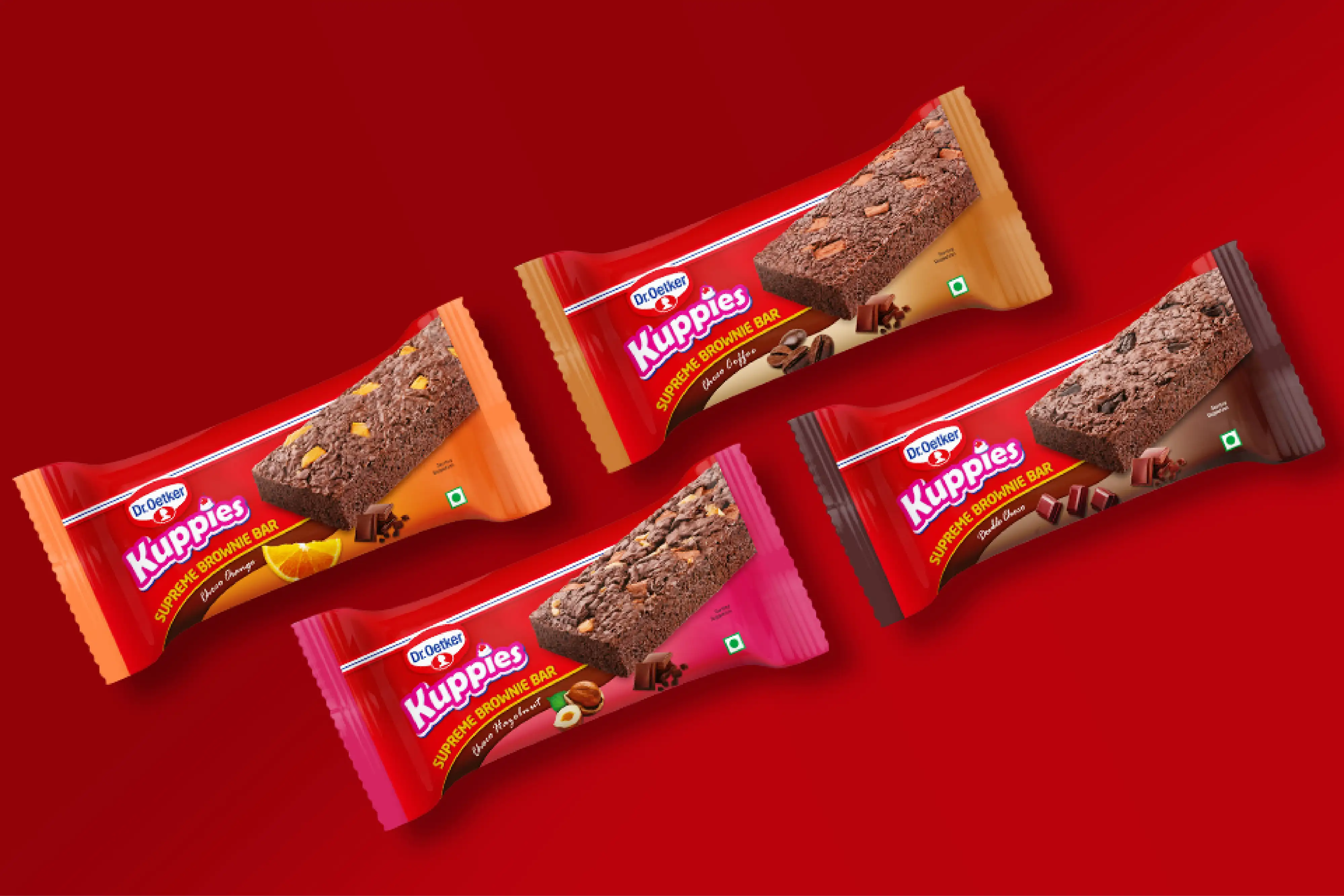
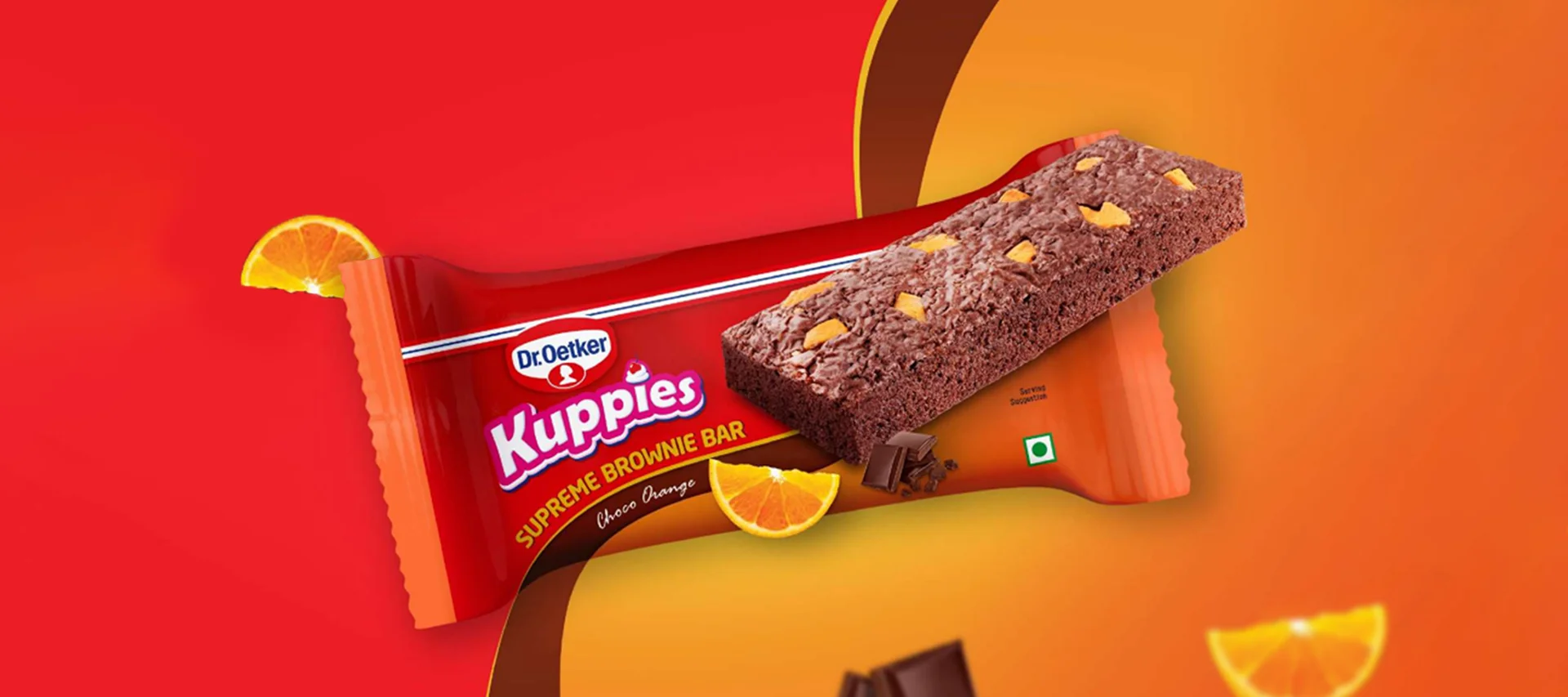
KUPPIES, a brand under Dr. Oetker, specializes in delivering high-quality, ready-to-eat baked goods that cater to the modern consumer's need for convenience without compromising on taste. Known for its delightful range of cakes, muffins, and other baked treats, KUPPIES blends tradition with innovation, ensuring that every product offers the perfect balance of flavor and freshness. Designed to be enjoyed anywhere, KUPPIES is committed to making indulgence accessible and satisfying for all.

BRIEF, OBJECTIVE & TASK

In the ever-evolving world of desserts, Dr. Oetker's Kuppies has carved out a niche with its diverse offerings of indulgent treats. Known for its commitment to delivering high-quality dessert products, the brand sought to elevate its Brownie Range through a strategic packaging redesign. Recognizing the importance of maintaining brand consistency while introducing a fresh appeal, our task was to develop packaging that highlighted the rich, decadent nature of the brownies while seamlessly integrating with the existing Kuppies lineup. In the competitive dessert market, rebranding a product to position it as a premium offering while retaining customer loyalty is a significant challenge. Understanding the need to elevate its product range, our agency partnered with KUPPIES to rebrand their new brownie range. The objective was to craft packaging that not only conveyed a sense of luxury but also stayed true to the brand’s established visual identity. By merging sophisticated design elements with the brand’s essence of indulgence and quality, the new packaging was created to stand out on shelves, attracting discerning customers and reinforcing the premium nature of the brownie range. For Dr. Oetker Kuppies’ Brownie Range, the packaging design presented a unique challenge—maintaining brand colors, hierarchy, and a consistent pack structure while ensuring that the new product line still commanded attention on the shelves. The task required a careful balance of simplicity and distinctiveness, where the familiar elements of the brand had to be preserved without overshadowing the individuality of the new range.

APPROACH & RESULT

The key architecture element i.e. the swoosh symbolizes the dynamic flow of emotions throughout the packaging. This flow is crucial as it guides the viewer's eye across the pack, evoking feelings of indulgence and satisfaction. It seamlessly integrates into the design, represents the architectural framework that underpins the entire visual language. It creates a sense of movement and continuity, linking the various design elements together into a cohesive narrative. This combination of flow and architectural structure ensures that the packaging not only captures attention but also communicates the product's premium quality and the indulgent experience it offers. This strategic use of visual elements is what makes the architecture of the pack both impactful and memorable. The design strategy centered around keeping the visual architecture simple and aesthetically pleasing, ensuring that the premium quality of the product was immediately apparent to the consumer. We emphasized the use of clean, non-exaggerated drool shots that convey the indulgent nature of the brownies without overwhelming the design. This approach guarantees that what consumers see on the packaging is a true reflection of the product inside, building trust and enhancing the overall brand experience. The design effectively distinguishes the four packs through a strategic approach to varianting while maintaining a unified visual identity. Each pack employs a distinct color scheme that reflects its unique flavor profile, alongwith the display of ingredients allowing consumers to quickly identify and differentiate between the variants.

Explore More Brand Associations
Want to work with us?