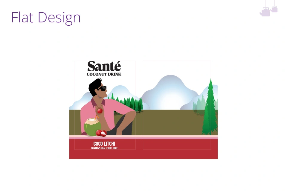
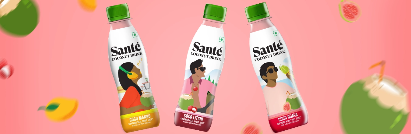
×

BACKGROUND

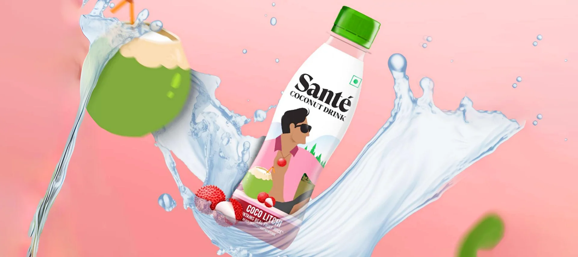
Sante is a dynamic and innovative non-alcoholic beverage from the house of Anheuser-Busch, specializing in refreshing coconut and fruit-based drinks. Known for its commitment to quality and natural ingredients, Sante offers a diverse range of beverages that capture the essence of tropical flavors. Whether it's the hydrating goodness of coconut water or the vibrant taste of fruit blends, Sante aims to provide delicious, healthy, and revitalizing drink options for consumers seeking a refreshing alternative to conventional beverages.

BRIEF, OBJECTIVE & TASK

Fruit-infused coconut water is rapidly gaining popularity as a go-to beverage for health-conscious consumers, particularly among the youth, who appreciate its refreshing taste and natural hydration. As a healthier alternative to sugary soft drinks, these fusion beverages are favored by young adults seeking both flavor and wellness in their daily routine. Recognizing the growing demand in this category, Santé launched a new range of coconut water drinks blended with fruits, offering three exciting variants – Coco Litchi, Coco Mango & Coco Guava. Creating packaging for a new range of beverages that seamlessly integrates with an existing brand portfolio while standing out on crowded shelves is a significant challenge. With Sante's launch of fruit-infused coconut water drinks targeted at the youth, the task was to develop a design that not only captured the essence of vibrant flavors like Litchi, Mango & Guava but also aligned with the brand’s established visual language. Balancing the need for consistency with the desire to introduce fresh, eye-catching elements, the packaging design had to ensure that the new range felt like a natural extension of Sante's portfolio while also grabbing attention with its bold, youthful appeal.

APPROACH & RESULT

Studying the illustration style established by Santé, we explored new visual stories that would seamlessly align with the brand's existing design language while introducing fresh concepts for their new range of fruit-infused coconut water drinks. To create engaging story concepts for the packaging, we delved into the lives and interests of the youth, the target audience for these drinks. Recognizing the activities that the youth enjoys, such as chilling at home, listening to music, outdoor adventures, and playing musical instruments and much more, we adapted these relatable scenarios into the packaging design, ensuring each variant told a story that resonated with this audience. Drawing inspiration from tropical settings and the vibrant lifestyles of the youth, the packaging integrates these elements with the brand’s established illustration style. For example, the Coco Litchi variant depicts a relaxed figure savoring the drink in a serene outdoor setting, subtly incorporating the fruit within the narrative. The color palette was carefully selected to reflect the natural vibrancy of the fruits, ensuring the design pops on the shelf while maintaining a cohesive visual identity with the existing range. By balancing the existing brand language with the introduction of lively, youth-oriented stories, we created a packaging design that not only stands out but also feels like a natural extension of the Santé portfolio. The result is a vibrant, engaging range of coconut water drinks that captures the essence of youth and the refreshing taste of tropical fruits.

Explore More Brand Associations
Want to work with us?