×

BACKGROUND

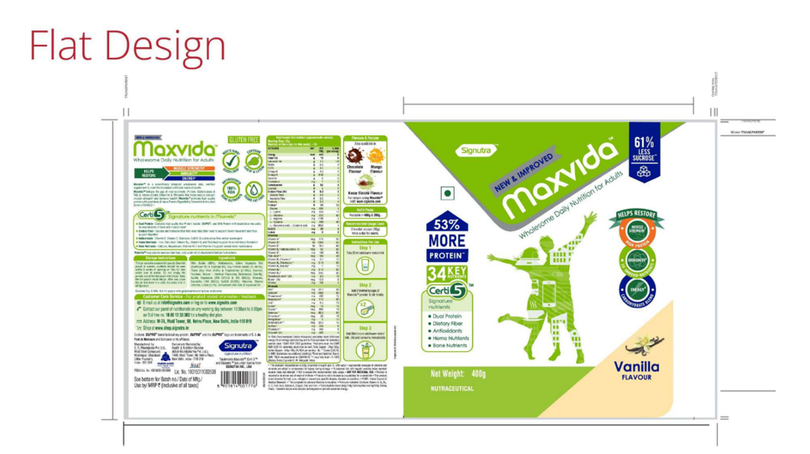
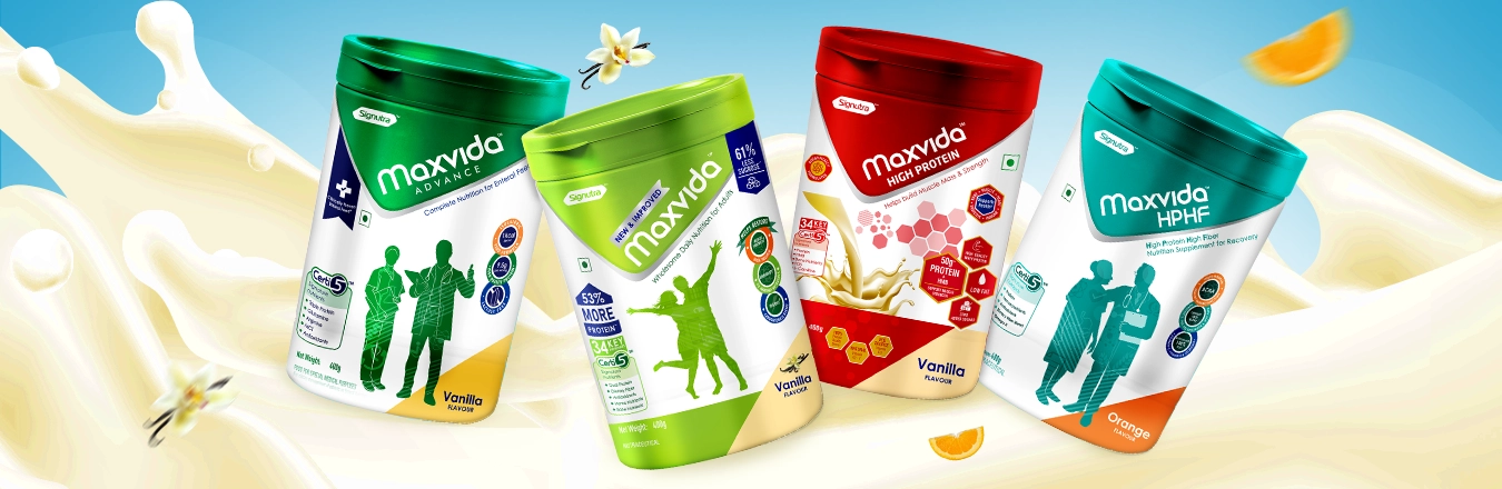
Signutra is a prominent health and wellness company dedicated to developing scientifically-backed nutritional solutions. Its flagship brand, Maxvida, is designed to provide balanced nutrition and cater to the dietary needs of adults and the elderly. Maxvida offers a range of products enriched with essential vitamins, minerals, and proteins, supporting overall health and wellness. Signutra’s commitment to quality and innovation is reflected in Maxvida, which aims to enhance the nutritional status and quality of life for its consumers.

BRIEF, OBJECTIVE & TASK

Health and wellness products are increasingly becoming a staple in daily routines, appealing to health-conscious consumers of all ages. These products are trusted for their ability to support overall well-being, boost immunity, and provide essential nutrients. With the growing demand for high-quality supplements, particularly among adults and seniors, Signutra, under its renowned brand Maxvida, introduced a new range of health supplements designed to cater to diverse nutritional needs. The market is saturated with numerous health supplement brands, presenting the challenge of making Maxvida's products stand out on the shelves and resonate with discerning consumers. Our objective was to follow the established brand visual architecture to create compelling new packaging designs for Signutra’s latest offerings under its Maxvida brand. The challenge lay in adhering to the existing visual architecture, which featured a distinct silhouette style for the key visuals while ensuring that each health supplement variant stood out on the shelf. This required a thoughtful exploration of colors and design elements that would not only align with the brand’s identity but also effectively communicate the unique benefits of each product in the range.

APPROACH & RESULT

Our design approach was rooted in crafting a distinctive and impactful visual identity in line with its existing visual architecture - that embodies the brand's dedication to health and vitality. We embarked on a thorough exploration of various silhouettes, ensuring that each form used in the packaging not only captures attention on the shelf but also resonates with the product’s fundamental values. These silhouettes, inspired by the core principles of nutrition and well-being, symbolize the equilibrium and wholeness that Maxvida promises. Each shape was meticulously designed and seamlessly integrated into the packaging, enriching the visual narrative and adding depth and dimension to the overall look. The color selection process was equally thoughtful, guided by global color codes that ensured a consistent and appealing visual language across the product range. the packaging design leverages the strategic use of white as a dominant element to create a clean, professional, and trustworthy appearance. The play of white across the packs provides a sense of purity and clarity, aligning with the brand’s focus on health and nutrition. To differentiate between variants, we introduced a carefully selected color palette, with each color reflecting the specific nutritional benefits and unique attributes of the respective variant. These colors are not just accents; they play a crucial role in the varianting process. The color behind the Maxvida logo, for instance, changes with each variant, providing an immediate visual cue for consumers to distinguish between the different offerings. The balance of white with these variant-specific colors creates a harmonious yet striking visual contrast, ensuring that each pack is both eye-catching and informative. This approach not only enhances brand recognition but also aids consumers in easily identifying and selecting the product variant that best suits their needs. To further enhance the packaging, we developed a dynamic abstract pattern that flows across the packs, inspired by key nutritional elements, brings a sense of energy and movement. The design is complemented by clear, modern typography, which reinforces the brand's scientific foundation while maintaining an approachable and engaging feel. The outcome is a packaging design that not only encapsulates Maxvida’s commitment to delivering exceptional nutrition but also distinguishes itself in a competitive market. It speaks directly to discerning, health-conscious consumers who prioritize quality and dependability in their dietary supplements. The design goes beyond mere aesthetics, resonating with the audience's aspirations for a healthier lifestyle and reinforcing Maxvida's position as a trusted ally in their wellness journey.

Explore More Brand Associations
Want to work with us?